Getting Started
Smart Editor helps you customise your application UI, with live design changes right here. Continue below to know how it helps in customising your UI design and get familiar with Smart Editor.
How it works?
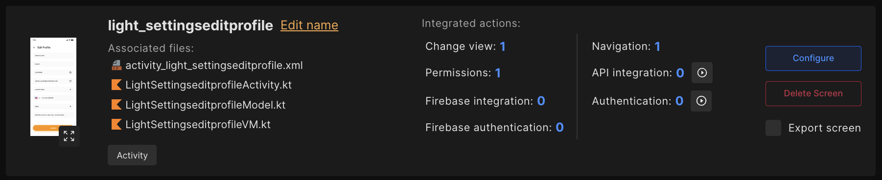
To open the Smart Editor, select a screen from the screen list for which you want to customise UI, and click on Configure.
Get familiar with Smart Editor
This section will help you to get the Smart Editor interface and will guide you on how it helps to customise your complete app UI.
onClick property;Preview and once your application is set up with everything, Build it and obtain the source code.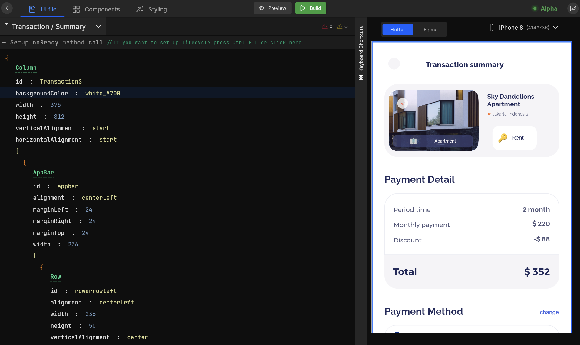
1. Editor Area
A complete creative space with easy-to-go declarative syntax where you can customise your UI by editing, modifying, deleting, or grouping components. Also, add properties, and modify their value easily. Also, it allows you to set up the below action right from here with onClick property;

API Integration
App Constants
Change Widget
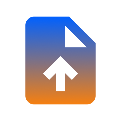
File Upload
Navigation
Open Drawer

Permissions

Set Hyperlink
Show Alert

Social Authentication
Setup app lifecycle
Setup how your application state should change by managing the app lifecycle of your app. Learn more.
2. Editor Tab Bar
Switch and manage easily between UI file, Components, and Styling support added to your entire application.
UI File:
- The current selected screen’s entire UI can be viewed or modified here. You can set up different actions on the screen widgets, modify widgets based on their properties with live preview, and many more.
Components:
- All the auto-identified common components for the application are listed here, along with their attributes and variants.
- Easily edit properties and modify your components directly from here.
Styling:
- Styling is used to manage the theme of an app. Styling includes the app’s colors, fonts and images used in it. In Styling, you can add, edit or view all your app’s colors, fonts and images easily.
Color:
- On this screen, the colors used in your application are listed for both 🌞️ Light theme and 🌙 Dark theme.
- Also, you can search colors by color name.
- To Edit color, click on 📝 icon and update it as per your requirements.
- On click of
Create new color style, You can quickly create new colors by providing the color a name and selecting a color from color picker, or by providing the color code for both the 🌞️ Light and 🌙 Dark themes. You can also change the opacity of the color and click onSubmit.
Video tutorial for Add and Update Colors on your Screens.
Fonts:
- On this screen, the fonts used in your application are listed along Weight, Style and Type.
- Also, you can search fonts by font name.
- To Edit font, click on
Replace fontand update it as per your requirements. - On click of
Upload custom fonts, You can quickly create new font by providing font file and enter font family and select weight for font and click onSubmit.
Video tutorial for Font Styling in Screens using Smart Editor.
Assets:
- On this screen, the assets used in your application are listed along with Type.
- Also, you can search for an image.
- To Edit asset, click on
Replace Imageand update it as per your requirements. - On click of
Add new assets, you can quickly create new asset by providing Asset name and uploading asset file and click onSubmit.
Video tutorial for Assets Handling using Smart Editor.
String:
- On this screen, the String used in your application are listed.
- Also, you can search for a String.
- To Edit String, click on 📝️ icon and update it as per your requirements.
- On click of
Add new String, you can quickly create a new string by providing Key and Value and click onSubmit.
3. Screen Navigation Bar
Navigate between application screens, select the one and make changes to it.
Search Screen:
Easily search the screen from the list with its screen name and switch to the screen.
Sync design changes:
Open the Screen Navigation Bar on the topmost left corner, and Click on the 🔄 icon in the screen selection dropdown to apply the latest Figma design changes to the old design in DhiWise.
- Once you click it, you will get a list of screens available in your Figma design. Also, the last synced screens will be displayed for your convenience.
- Also all the new screens added in Figma file will be displayed right here,
New added in Figma,Not synced, andAlready addedwith different colors, to refer easily. The screens can even be filtered based on status. - Next, you need to select the screens you wish to resync. You will be prompted to
AcceptorDiscardsuch changes. Then, clickNext. - Once you sync your Figma with DhiWise, if there are any conflicts it will detect them, a popup will appear that you can choose to
Skipor use toResolvethe issues. - If you go with the
Skip, you will be redirected to the Editor page, and screens with conflict will be highlighted in Red. - If you click on
Resolve, conflicts for the particular screen will be displayed, where you can resolve them, and then clicking onApplywill add new changes to the design.
4. Build or Preview
Easily preview your applications using Preview and once your application is set up with everything, Build it and obtain the source code.
Build
- After changes, Build your app and get your app code within a single click on the
Buildbutton which is above in the Smart Editor in the center, you can also download it or sync code directly with GitHub or GitLab.
Preview
- You can also Preview your complete app’s screens and see the generated UI output with the
Previewoption, you can also switch between all the app screens from here.
5. Errors and Warnings
This area shows information about errors and warnings related to that screen while you make your changes, prior you build your application. So you can improve your design and make it correct while you are customising that screen and get accurate design results.
6. Live Rendering
Changes you make to your screen, like modifying a component or removing a component are previewed here immediately, without the need to rebuild the application.
Easy design switch
Easily switch between Figma screen and Editor preview for a screen, which would be easy for you to see what changes are made, while you modify that screen.
7. Keyboard Shortcuts
Keyboard shortcuts increase your productivity for most of the features like grouping components together, ungrouping the components, deleting a component, changing a component, and many more. Memorizing these hotkeys can help you stay more productive by keeping your hands on the keyboard.
If your keyboard has a layout other than English, DhiWise may not detect all the shortcuts correctly.
| Shortcut | Action |
|---|---|
| Ctrl + K | Change widget |
| Ctrl + G | Group widget |
| Ctrl + Shift + G | Ungroup Widget |
| Ctrl + S | Save changes |
| Ctrl + Space | Quick suggestions |
| Ctrl + B | Edit action |
Video tutorial for grouping components, ungrouping components and deleting a component.
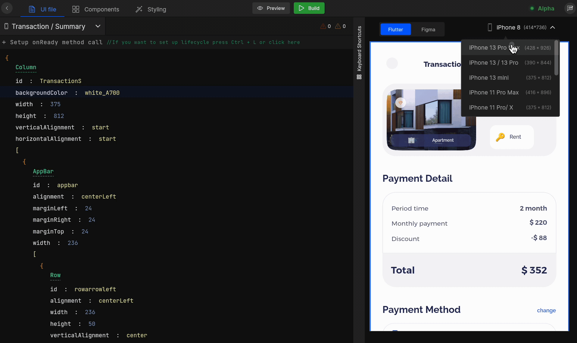
8. Viewport Selection
Preview your screen design on your desired viewport size by selecting the one right here.
Smart Editor in Action
Here is a go-through of how you can start working with Smart Editor. From changing components to API integration all can be done with ease. Watch out for a quick video to learn about how to use Smart Editor.
Got a question? Ask here.